
rvaMORE x Ampersand Design Co.
The Project
rvaMORE is a local nonprofit focused on building and maintaining sustainable mountain bike trails throughout the greater Richmond area. Their work brings people outside, builds community, and helps protect the places we all love to ride.
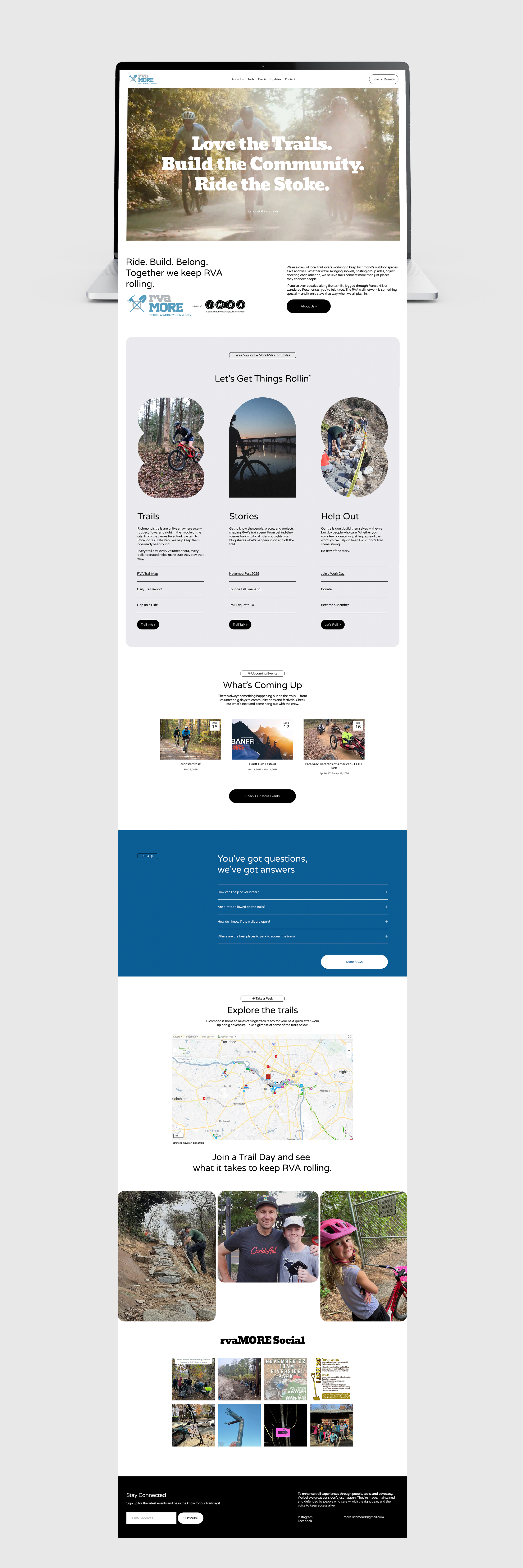
As rvaMORE continued to grow, their website needed to grow with them — not just visually, but structurally and thoughtfully. They needed a digital home that could handle a lot of information without feeling overwhelming, while still feeling welcoming to new riders, volunteers, and supporters.
A website built for trail days, community nights, and everything in between
The Challenge
rvaMORE’s website had a lot to do — and a lot to say.
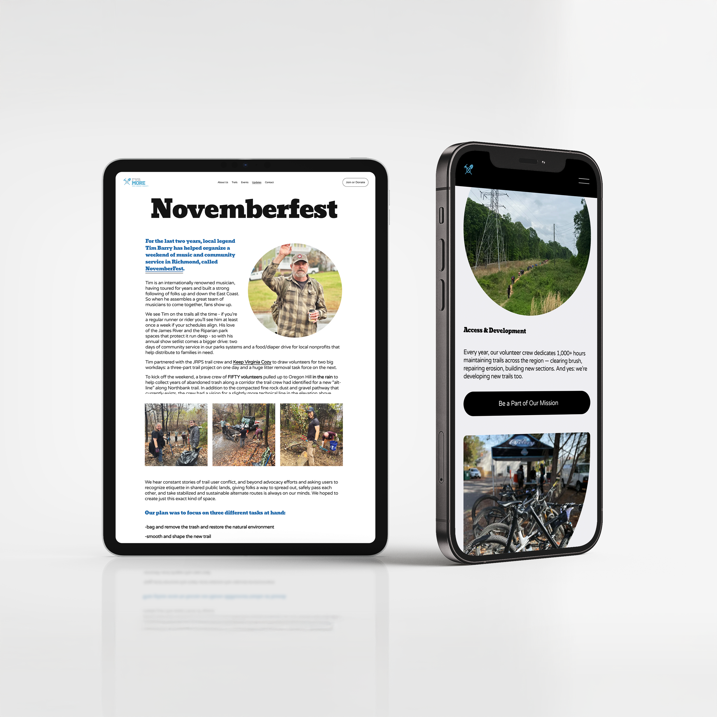
Between trail reports, events, blogs, education, and community updates, the site needed to support real, everyday use. At the same time, it had to clearly communicate the why behind the organization: why trails matter, why community matters, and why memberships and donations make a real difference.
The biggest challenge?
Finding the right balance between fun and functional, relaxed and reliable, community-driven and professional.
The Approach
Before diving into design, we stepped back and focused on how people actually use the site.
We worked with the rvaMORE team to:
Organize content around how riders, volunteers, and supporters think
Create a navigation that makes it easy to find what you need without digging
Write content that feels conversational and approachable, but still clear and informative
Make calls-to-action for memberships and donations feel natural, not pushy
The goal was simple:
Make the site feel like rvaMORE — friendly, active, welcoming — while still being clear, useful, and trustworthy.
Content & Voice
A big part of this project was creating the website content itself.
We wanted the voice to feel:
Relaxed and friendly, like a conversation at the trailhead
Inviting and fun, without trying too hard
Professional and informative, especially when it came to memberships, donations, and partnerships
Every page was written to be easy to read, easy to scan, and easy to understand — whether someone was visiting for the first time or checking trail conditions before a ride.
The result is content that:
Explains what rvaMORE does without overcomplicating it
Helps people feel comfortable getting involved
Builds trust by being clear, honest, and straightforward
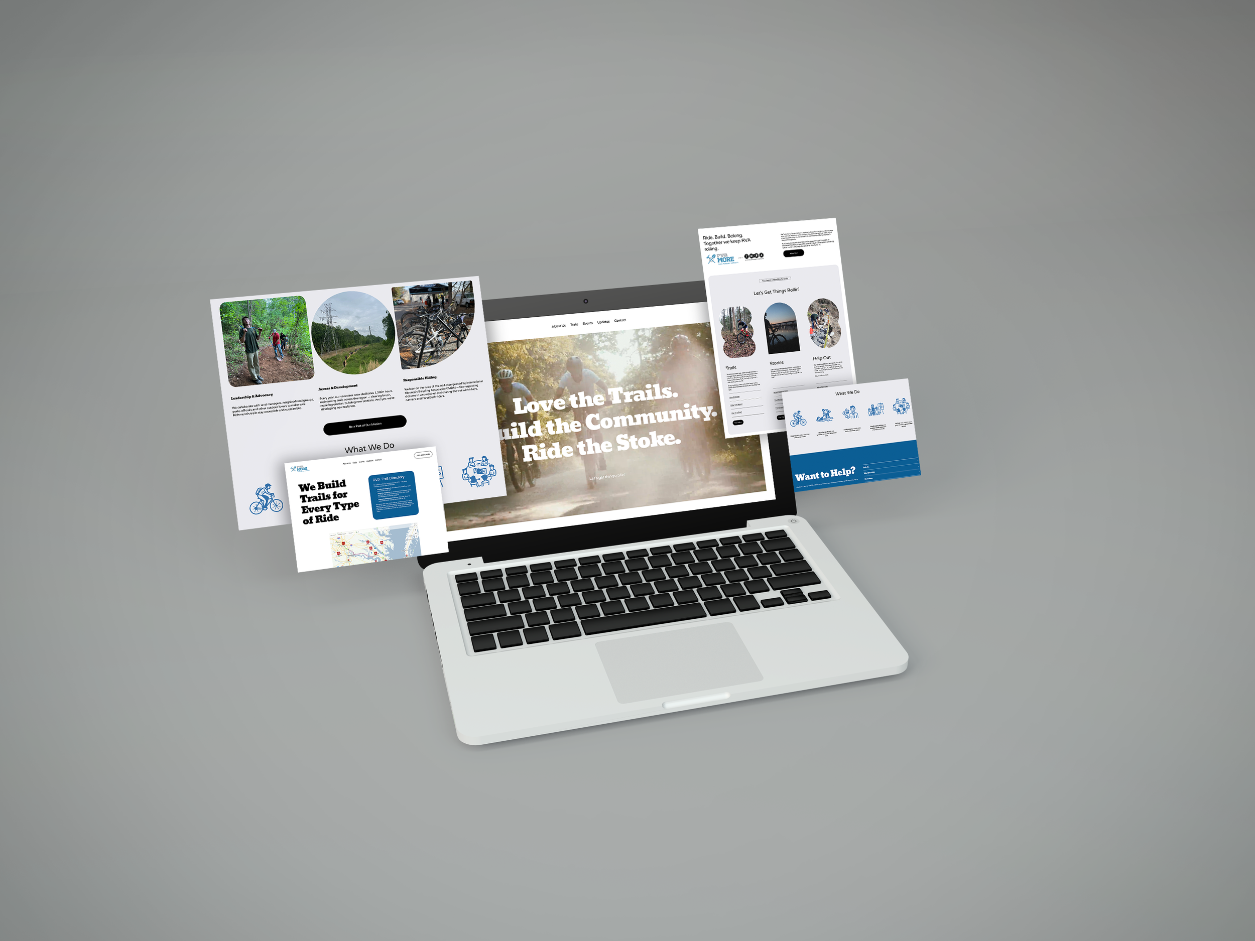
The Outcome
The new rvaMORE website brings everything together in one place — and makes it easier for people to engage.
Now, rvaMORE has:
A clear, easy-to-navigate site that supports daily use
Content that speaks to their community in a natural, authentic way
A flexible foundation that can grow as the organization grows
Clear paths for joining, donating, volunteering, and staying connected
Most importantly, the website now feels like a true extension of the rvaMORE community.
This project is a good reminder that good websites aren’t just about how things look — they’re about how they feel and how they work.
When content, structure, and design are aligned, a website becomes more than a place to host information. It becomes a tool for connection, participation, and long-term support.
Questions, anyone?
-
Because people connect with people. A clear, approachable tone helps visitors feel welcome and makes it easier to understand why support matters.
-
When people understand what an organization does and why it matters, they’re more likely to get involved. Clear, honest content builds that understanding and trust.
-
Simple navigation, approachable language, and a focus on real user needs — not just visuals.
A good website doesn’t try to do everything.
It does the important things well — and makes people feel like they are along for the ride.
(pun intended)
Ready to see what thoughtful branding can do for your business?
Explore our customer success stories — and imagine what’s possible when your brand is built with intention.